CONTACT
ABOUT
  • PROJECTS
  • HACK THE BUYER BRAIN | Book Cover Design
  • THE DUTCH OYSTER MAN | Brand Identity
  • SMITH HOUSE OF TEA | Branding & Packaging
  • ZAFARIS TRAVEL | Branding Identity
  • RISE MASTERCLASS | Brand Identity
  • PIENAAR & SON | Branding & Packaging
  • THE FINISHING STORE | Brand Identity
  • RED BULL | Summer Launch Campaign
  • CIGARETTE BOX INSERT | Illustration
  • LUNO BITCOIN WALLET | Illustration
  • LUCKY & LOU | Brand Identity
  • AUDIO NETWORK YOUTUBE LIVE EXPERIMENT - LOGO & DESIGN
  • VERB SKATEBOARDS | Deck Design
  • ADVERTISING AGE | Cover Illustration 2015
  • KIN MEDIA | Brand Identity
  • COLGATE BAMBOO | Illustrated Animation
  • ESPRESSO CONCEPTS | Packaging Illustration
  • SAVAGE & STRONG | Brand Identity
  • SPIER 1682 | Wine Label Illustration
  • SANLAM REALITY | Wall Mural Illustration
  • AVALLEN 'BEE POSITIVE' | Illustration
Cassandra Leigh Johnson
CONTACT
ABOUT
  • PROJECTS
  • HACK THE BUYER BRAIN | Book Cover Design
  • THE DUTCH OYSTER MAN | Brand Identity
  • SMITH HOUSE OF TEA | Branding & Packaging
  • ZAFARIS TRAVEL | Branding Identity
  • RISE MASTERCLASS | Brand Identity
  • PIENAAR & SON | Branding & Packaging
  • THE FINISHING STORE | Brand Identity
  • RED BULL | Summer Launch Campaign
  • CIGARETTE BOX INSERT | Illustration
  • LUNO BITCOIN WALLET | Illustration
  • LUCKY & LOU | Brand Identity
  • AUDIO NETWORK YOUTUBE LIVE EXPERIMENT - LOGO & DESIGN
  • VERB SKATEBOARDS | Deck Design
  • ADVERTISING AGE | Cover Illustration 2015
  • KIN MEDIA | Brand Identity
  • COLGATE BAMBOO | Illustrated Animation
  • ESPRESSO CONCEPTS | Packaging Illustration
  • SAVAGE & STRONG | Brand Identity
  • SPIER 1682 | Wine Label Illustration
  • SANLAM REALITY | Wall Mural Illustration
  • AVALLEN 'BEE POSITIVE' | Illustration

_

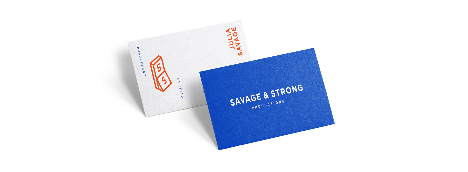
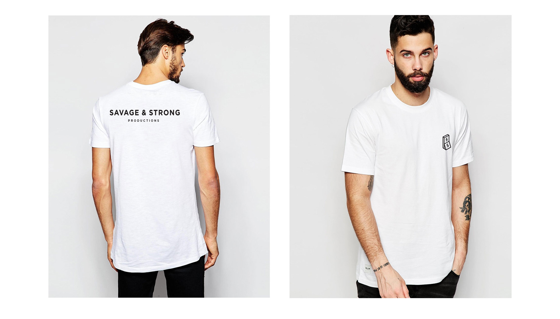
Introducing Cape Town based start-up, Savage & Strong. A turnkey production and logistical management solution specialising in events, film and stills. 

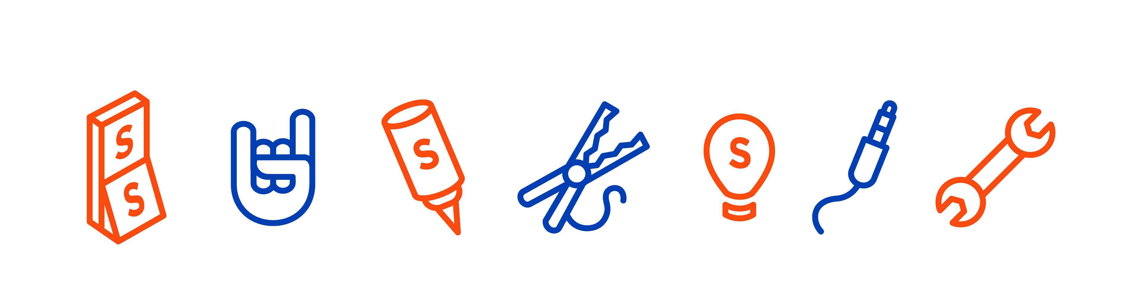
This branding project has a clean, minimalistic and classic use of font that has been deliciously balanced out with a contemporary use of bright colour & Illustration.
_

NOTE: Primary logo and use of colour was not chosen by client.

- THANK YOU -
↑Back to Top