_
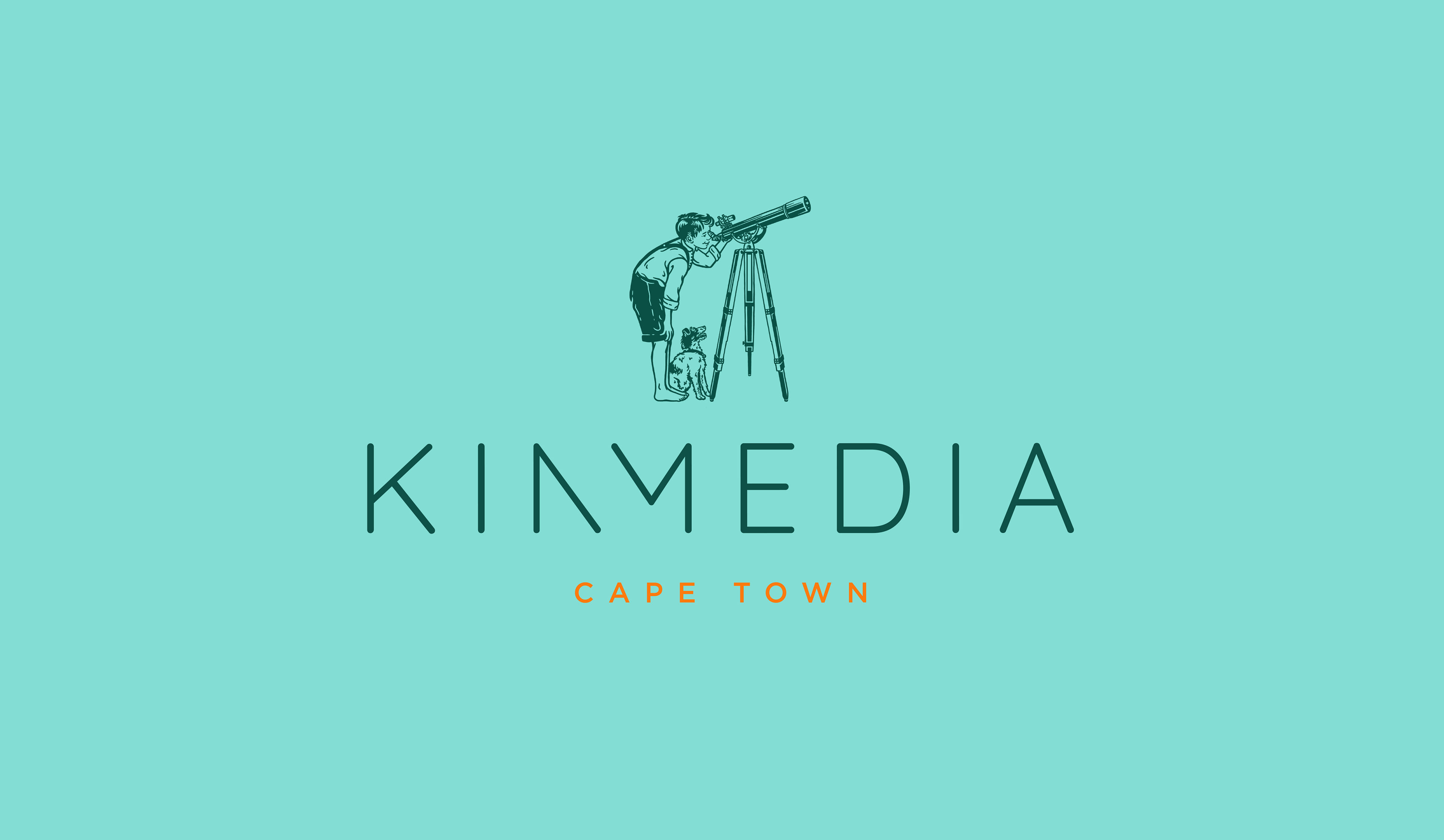
Introducing Cape Town based start-up, Kin Media, specialising in Post-Production and Digital Media Management.
They provide creative post solutions to brands, producers, agencies and organisations with an emphasis on creative project
management as opposed to line-itemed services.
management as opposed to line-itemed services.
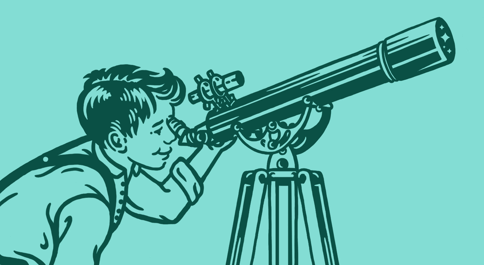
For this branding project I took an approach that resulted in a more classic direction to the logo design. There is an element of sentimentality & nostalgia attached to this particular piece - particularly the icon, as the style in which it has been illustrated has somewhat of a vintage finish to it. This has, however, been balanced out with an appropriate contemporary use of font.
The reasoning behind this particular image of the boy looking through a telescope, is a metaphor for all that Kin Media has to offer, as well
as it’s core values. The boy represents youth which in turn represents the future, adventure and a sense of excitement for all it has to offer.
It also portrays a positive energy & outlook on life, happiness, a fresh imagination as well as an ambitious creative drive. Looking through the telescope exemplifies the basic idea of ‘reaching for the stars’, as KIN Media offers endless possibilities......‘To the moon!’
It also portrays a positive energy & outlook on life, happiness, a fresh imagination as well as an ambitious creative drive. Looking through the telescope exemplifies the basic idea of ‘reaching for the stars’, as KIN Media offers endless possibilities......‘To the moon!’
_


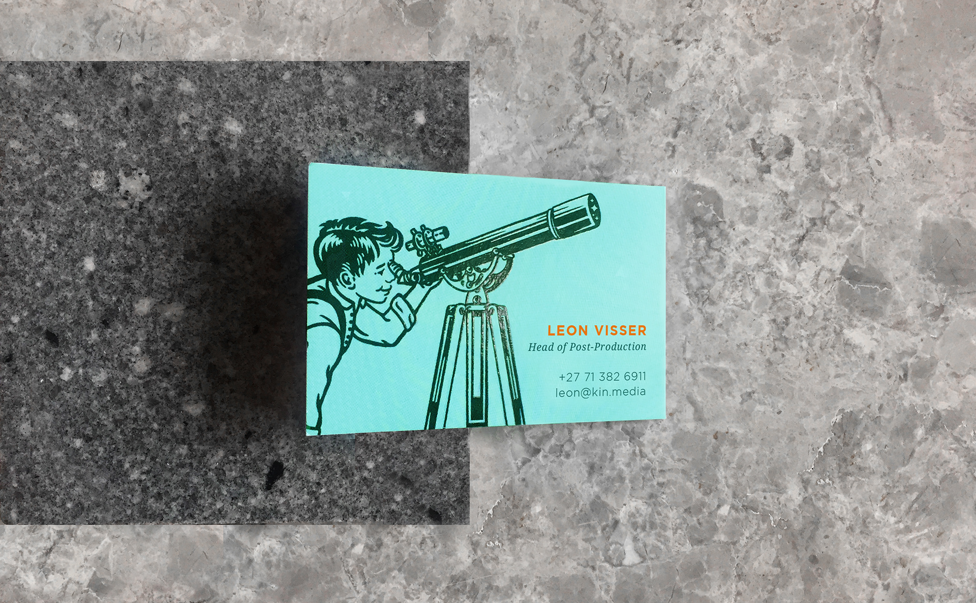
Litho with Spot Varnish
Website Profile Illustrations